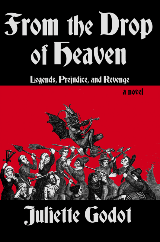
Why that cover? The Design
The Text
Why that cover?: The Text
The inspiration to use the font came from numerous texts at the Ephrata Cloister. The font resembles those used in the Gutenberg Bible and many other books and texts of that era. Craftsmen originally hand-carved the letters on blocks of wood for the first movable type printing presses. It was used on just about every publication from 1454 to the 1900s in northern Europe.
This is an authentic example of a page from the Gutenberg Bible, printed in the iconic Gothic textura (blackletter) typeface:

- Notice the dense double-column layout and uniform stroke thickness—hallmarks of medieval manuscript-inspired printing.
- Look at the ornate initial capitals and the occasional red rubrication (highlighted text) used to guide the reader through sections.
- The sharp angles and dense black strokes typify the textura style, with vertical emphasis and tight spacing.
- These prints served as direct inspiration for later presses like Ephrata Cloister, which adopted similar letterforms and flourishes.
Each of these images gives you a clear sense of the historic style that inspired your project’s visual identity—showing why the Ephrata Cloister’s typeface echoes the revered craftsmanship of Gutenberg’s 1450s press.
Chevaillier Engraving

Why that cover?: The Peasants
The vintage engraving art by Chevaillier is based on Roi Modus, a 15th-century manuscript. It depicts a scene of “beggars and peasants” fighting over wine. Science and Literature in the Middle Ages by Paul Lacroix, published in London in 1878.
The image captures more than a simple brawl—it reflects the social tensions and hardships of medieval life. Wine, a symbol of both survival and celebration, was often scarce among the lower classes, making its possession a cause for conflict. The exaggerated gestures and grim expressions in the Chevaillier engraving speak to the desperation of the era, when famine, war, and rigid class structures left little room for mercy. As both art and artifact, the piece offers a window into the daily struggles of the forgotten majority—the peasants whose lives were rarely recorded, yet whose suffering shaped the world we inherited.
The Devil’s Trill
Why that cover? The Devil
The devil is from another antique engraving, showing the notorious dream that Giuseppe Tartini had that lead him to compose his violin masterpiece, titled “Devil’s Trill”.

According to Tartini, in the dream, he made a pact with the devil and handed him his violin. The devil played with such brilliance, such otherworldly fire, that Tartini awoke in a frenzy, desperate to capture even a fragment of the music he had heard. The Devil’s Trill Sonata was the result—haunting, complex, and laced with technical flourishes that still challenge violinists today. The engraving evokes that chilling vision: the devil as both muse and tormentor, a reminder that inspiration sometimes rises from the darker corners of the imagination.

The story
In the minds of the people in 1585, the devil is forever present. Everyone is a heretic to one side or the other. Accusations of witchcraft abound. Though estimates vary widely, as many as 50,000 to 80,000 people were executed as witches between 1500-1600 in Europe, especially in the Holy Roman Empire and Lorraine.
Fear became a form of control, and religion the sharpest weapon. In villages tucked deep within forests and hills, neighbors watched one another with suspicion, and the line between piety and paranoia blurred. A failed crop, a sudden illness, or a child’s fever could all be blamed on unseen forces—and someone had to pay the price. Women, especially those who were widowed, poor, or simply different, became easy targets. Under torture, confessions were extracted, names exchanged, and the cycle of accusation continued. For the people of 1585, the devil wasn’t just a figure from scripture—he was the shadow in the woods, the misfortune at the hearth, and the reason that no one ever felt entirely safe.